Mother nature is simply A-M-A-Z-ING. She delights our creative spirit with a plethora of flowers in vast arrays of color. But wouldn’t it be grand to have more control of our flower palettes much like a painter controls theirs?
As designers, we often need creative solutions to craft what we have into what we need. When it comes to color, Design Master offers several tools to solve the issue. A white flower is a blank canvas. Spraying color on it fashions a bloom in straight-from-the-can color and works perfectly in some situations. Other times, we wish a blossom color to be just a little bluer or have more red influence, for example. This color finesse is Color Shifting in action . . . applying color on color to visually mix them and push the direction of the flower color into a desired new hue.
This primer is simply a foundation to develop your color shifting skills. Mimic nature or fabricate color elements. Nuanced color expands the possibilities for dynamic design palettes and your artistic expression.
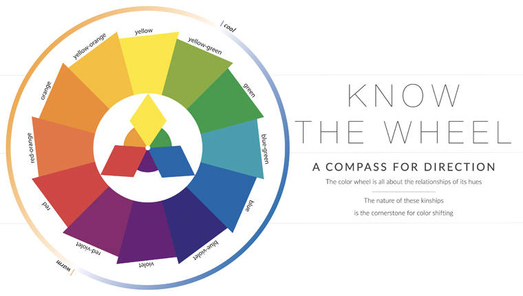
Understanding the color wheel is your greatest asset in achieving a successful color shift. While intuitive for many, making conscious choices is validating.
The color wheel is all about the relationships of its hues. The nature of these connections is the cornerstone of color shifting.
Begin with the basics. The expansion of the color wheel all starts with the powerful nucleus of 3 primary colors, SUPERHEROES Red – Yellow – Blue. Every other color visible to us has some influence of at least 2 of these hues! Mixing 2 of the primary colors together produces 3 secondary hues, Orange – Green – Purple. These 6 core hues are used to describe subsequent mixtures known as tertiary colors. They complete the color wheel.
Knowing the origin of a color provides direction in choosing the color you need to shift a blossom color.
For example, you need a peach-toned bloom with none on hand. Peach, all be it a lighter value, has influence of yellow and red. To make peach, select light-valued colors of yellow and red, such as a soft yellow flower and a pink spray. (Pink Petunia or Wild Rose perhaps). Subtleties of the yellow and of the pink will influence the resulting peach hue. But, the results will remain in the peach family.
M O N O C H R O M AT I C
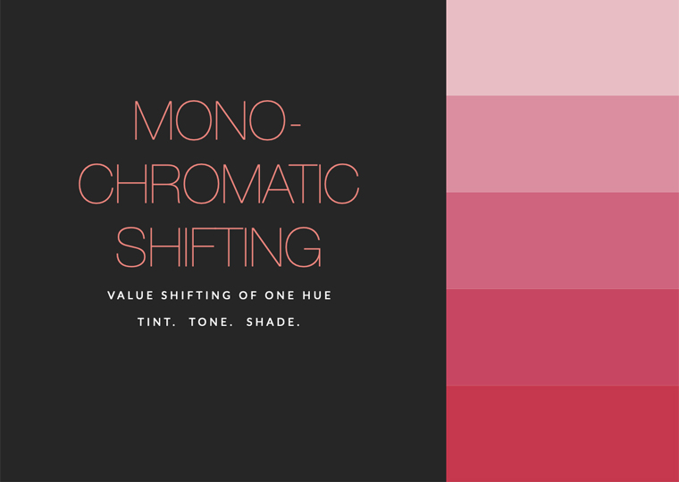
Many times, we wish bloom color to be lighter or darker. Monochromatic shifts are fashioned in two ways.
To push color lighter chose a COLORTOOL Spray of the same color family that is a lighter value than the blossom. IE. Apply Blush over pink to lighten.
To darken a bloom select a Just For Flowers or COLORTOOL Spray in a deeper color of the same family. On the previous pink choose Bougainvillea or Raspberry to deepen it.
A N A L O G O U S
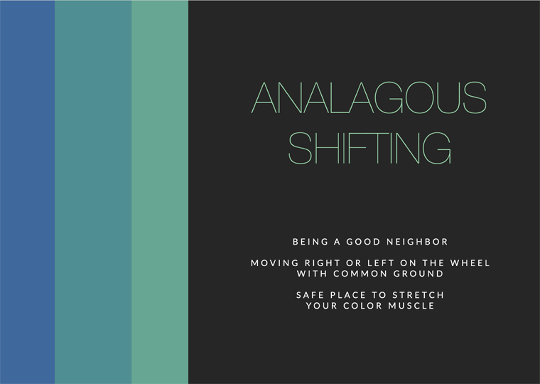
More often than not the colors used for shifting will have an analogous relationship. Neighboring each other on the wheel the colors share origins. Pushing them another notch is not a stretch. Just like analogous colors create easy, comfortable designs, mixing them is a comfortable reach.
C O M P L E M E N TA R Y
Complementary colors, those hues directly across each other on the color wheel, used together in a design palette will make each other look vibrant. That bright disposition quickly turns moody however when the colors are mixed. The result is brown. Uniquely, each of the complimentary pair has its character in the brown created. It’s a great direction to fashion elements for a moody palette. Muddied tonalities are also achievable by color shifting with the neighbors of the complement.
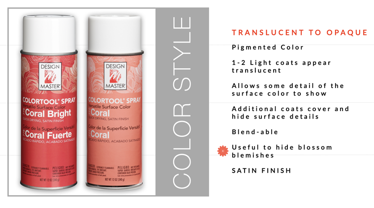
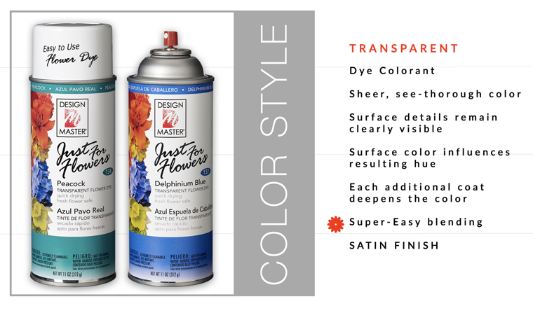
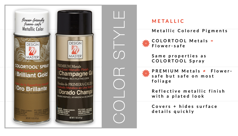
COLOR STYLES : CHOOSING YOUR COLOR TOOL
The coloring agents that make up our various color tools have different properties. Knowing the style of Design Master color is helpful choosing which product to use.

